Software AG, headquartered in Darmstadt, Germany, is an enterprise software company operating in more than 70 countries
Marketing leadership reporting had grown in scope over the years, sometimes reaching 30 pages per week, as it attempted to be all things to all people, but when those reports stopped coming, few even reacted to the change
Over the course of a six-week project, Software AG designed a new CMO dashboard that has made leadership reporting much more succinct, focused, and actionable.
The company has seen widespread adoption of reporting that had been rarely used in the past. Reporting can be produced in a fraction of the time, and is driving deeper discussions and more rapid decisions.
Bill Carney, VP of growth marketing, took the lead in organizing the project on behalf of Software AG’s CMO, Paz Macdonald. In addition to his growth marketing responsibilities, Carney oversees the organization’s marketing operations department. Software AG is among Europe’s largest software vendors, operating in more than 70 countries and managing marketing reporting across business unit, region, and country-level views.
The Challenge
Wanted: A Marketing Leadership Dashboard To Support Clear Decision-Making
When Carney joined Software AG, there was no shortage of reporting available to marketing. There was a strong desire for data collection, but the organization had not yet struck the right balance between informing leadership and focusing decision-making. Over time, the company had developed a labor-intensive weekly marketing leadership report of 20 to 30 slides that combined data assembled by a reporting resource and commentary contributed by field marketing. However, this time-consuming effort was not delivering the clear business insights desired.
According to Carney, “The report operated like a scrum board for marketing, but when you send that upstream it doesn’t get read. People had a desire to manage the business using these reports, but they didn’t always understand what they meant or what they should do with them.” Peter Simpson, VP and EMEA regional marketing leader, joined the organization around that time, adding a field marketing voice to the project. “Reporting justified our investment in marketing, but it presented so much data that it was no longer being read, and was not providing any impact.” He agreed to help launch a new reporting approach.
A team of contributors from within corporate marketing, field marketing, and marketing operations set out to create a new CMO dashboard. The project needed to align to a company-wide transformation project led by CEO Sanjay Brahmawar, give clear insights on results, and remove confusion and debate about the underlying data.
The Solution
Building The Three Slides That Would Set A Company-Wide Standard
Carney began the process soon after he joined the company, focusing first on report frequency. There was concern that leadership needs would not be met unless the reports were delivered at least weekly, but the manual nature of the reporting required so much time (60 hours or more) to complete that little time was left to focus on improvement. He decided to test a move to monthly reporting, and found that stakeholders were comfortable with that cadence. The test confirmed a suspicion that the reports were not being read consistently, as there was little end user reaction when the report no longer arrived each week.
Team members planned their work around concepts represented by Forrester’s Metrics Spectrum and the Aligned Measurement Process Model, which gained them approval for the project. “You’ve got to be able to justify change. Forrester provided a proven framework that we could point to and say ‘this is how we can do it,’” said Carney. Although the eventual goal was to deliver real-time, self-service dashboards, the team agreed the priority was to deliver the right content regardless of the delivery mechanism.
The team worked to identify the project scope, objectives, and key stakeholders. Fine-tuning the use case was a critical part of the process. Previously, reporting had continually grown in scope because it sought to serve the needs of too many stakeholders at different levels of the organization. The team worked to identify the key questions that Macdonald wanted the dashboard to answer, then to identify the metrics required to meet those needs.
Once key metrics were established, the dashboard reporting specialist used some of the time freed up by the move to monthly delivery to build standardized reports within Salesforce to feed each new chart — filtered by business unit, region, or country. The team worked with the in-house creative team to improve the look and feel of the reports. Forrester analysts provided ongoing feedback on each iteration.
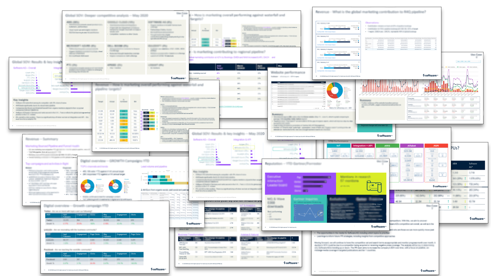
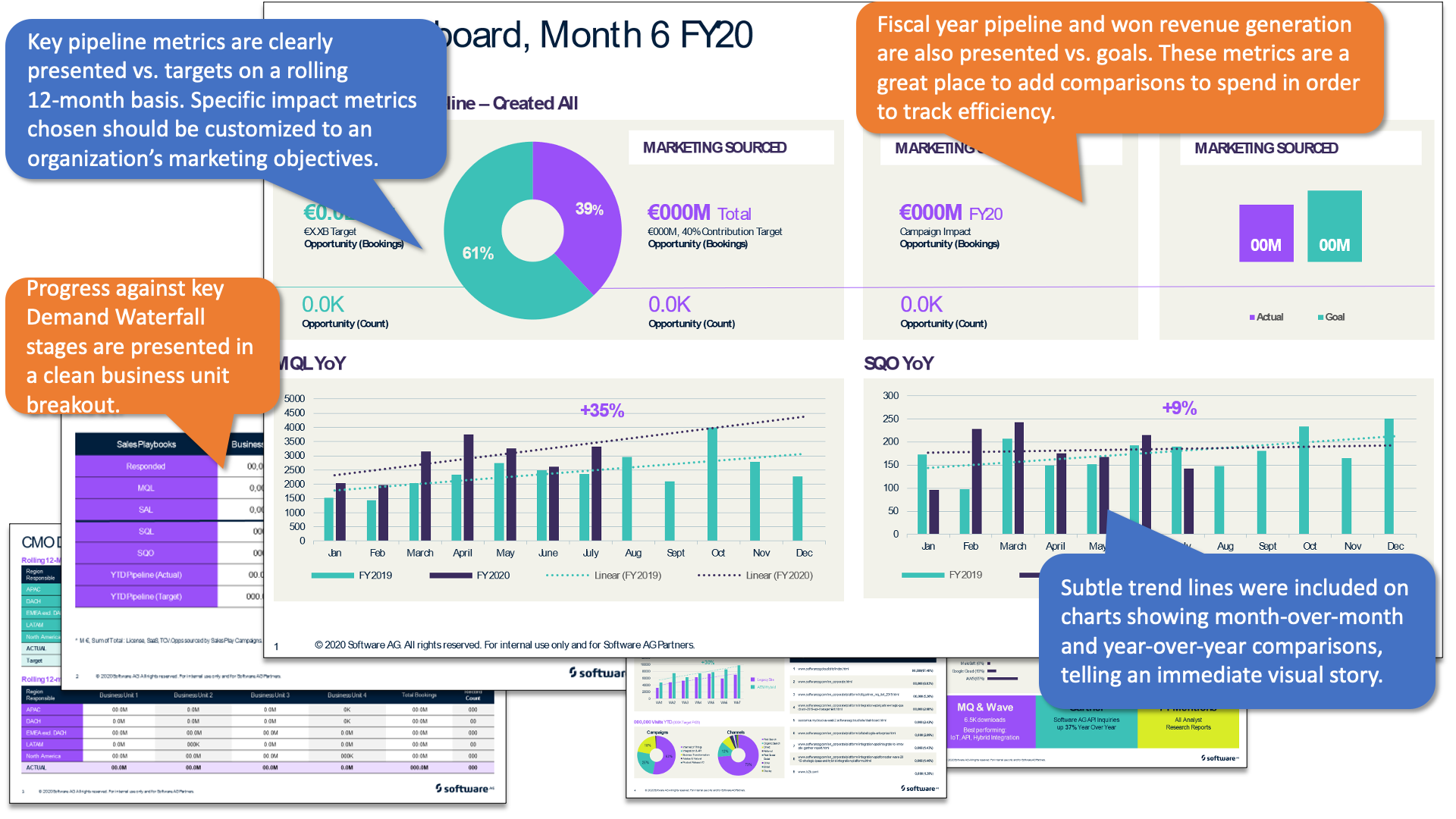
The result was a streamlined view of marketing performance focused on three slides presenting impact metrics — summary business metrics that can be tied directly to goal achievement. The slides focused on pipeline contribution vs. goals and key Forrester Demand Waterfall® metrics across regions and business units. As reporting evolves, the team may add efficiency metrics. Two additional slides were added: one focused on public relations/ analyst relations activity and a special project slide highlighting a key initiative leadership wishes to monitor in more detail. These may be retired as needs change, or replaced by other focus areas identified by Macdonald.
Measuring The Results
The launch took place in less than six weeks, replacing the previous approach to monthly reporting. The work already done positioned the team to move forward with dependable data, and strong leadership support allowed the team to move quickly. The response was immediate: The CEO and CRO were enthusiastic about the new dashboard, and end users began anticipating the arrival of the report each month.
The new dashboard was also a success for Macdonald, its primary stakeholder. “We are now focused on the metrics that matter to our business — pipeline and bookings, and marketing’s contribution to each. The dashboard now tells a story, month over month. The insight has helped us correct course and make incremental improvements. I can now better communicate my team’s performance.”
The time it took to build the reporting dropped dramatically, from 60 hours per week to six — no more than an hour per day. Time has been freed up, allowing the team to consider other use cases. The process has become repeatable and less dependent on the expertise of a single resource. Interns now create most of the regional and country-level views, and planning is underway to move toward real-time reporting.
Simpson helped pilot the use of the format beyond the CMO use case by using the slides in meetings with sales, including his quarterly business review (QBR). After presenting the three key slides that applied to field marketing, he could simply open Salesforce and use the standardized reporting to share details that exist in a system that sales and marketing share. “He was changing the mindset of the people he was presenting to,” said Carney, “because the facts are there, the facts are friendly, and we’re making data-driven decisions. We’re now having the same amount of impact; we’re just telling the story in a tighter way that shows respect for our audience’s time.”
The information is presented on a monthly basis and is now the de facto way to present marketing. The same three slides are leveraged for global, regional, and country-level views, and used in the QBR meeting at every level. The dashboard also impacts budget planning, which has become more focused on the right metrics. It allows field marketing to put forward a business case for increased investment on the basis of how best to achieve progress using key metrics.
Simpson believes the leadership team now has the insights to ask better questions. “We can talk about the relative impacts of cancelled trade shows, how we mitigated those impacts with increased digital activities, and how marketing qualified leads actually went up. We’ve graduated.”
How Forrester Helped
Companies pursuing a goal of making data-driven decisions recognize that assembling accurate data is only the beginning. Defining project scope, identifying stakeholders, and getting their insight and buy-in in advance are also crucial. Defining the use case and focusing the story — carefully aligned against stakeholder needs and business objectives — can make a dramatic difference when communicating how measurement impacts the business. More is not always better, and the work a marketing operations team does during the early stages of the Aligned Measurement Process is key to finding the right answers. What is left out of the story can be just as important as what is kept in.
More From Forrester
Disclaimer: The above is an excerpt of a published Forrester case study. Forrester does not endorse Software AG or its offerings.