SunTrust Reboots Its Digital Platform With Responsive Design
With mobile and tablet usage now mainstream, a big hurdle for eBusiness professionals is how to scale digital experiences across consumer touchpoints without dragging development momentum to a near halt in the process. But how?
In previous research, we’ve highlighted the advantages of responsive web design and how it can simplify the development of web experiences across multiple consumer touchpoints. In our latest report, we explain how one company, SunTrust Banks, began an initiative to simultaneously improve its internal web project delivery processes while expanding its digital presence across new consumer touchpoints.
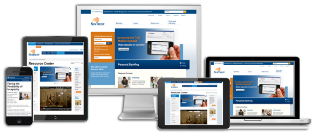
SunTrust, like many enterprise organizations, was expereincing a painstakingly slow, and costly, rollout of its digital platform. Demands from the business for digital experiences were on the rise, resulting in a 200% year-over-year growth in project requests. At the same time, SunTrust’s total traffic coming from mobile reached almost 10% of total digital traffic and tablet traffic was on the rise. With more and more devices emerging at a breakneck pace, the digital team at SunTrust knew they had to rethink their approach to web development. The team landed on responsive web design as a solution to their problems. Reponsive design enabled the digital team at SunTrust to focus resources on building and maintaining a single web platform instead of maintaining and optimizing multiple fragmented user experiences. They call it “The Power Of One.”
The end result can can be see here: https://www.suntrust.com/
For a step-by-step look at SunTrust’s reboot of its digital platform approach, I encourage you to check out our recent case study report here.
As always, I would love to hear your experiences of developing responsive sites.
Peter