How NOT To Crowdsource: Lessons Learned From The Gap’s Logo Debacle
 For those unaware of Gap's logo fiasco that unfolded over the past week, here's a quick rundown of what happened:
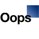
- On October 6, Gap rolled out a new logo that was meant to be "more contemporary and current" than the old blue box logo.
- A vocal group of people who hated the new logo raised a big stink via social media channels (Facebook, Twitter, blogs, etc.).
- Via Facebook, Gap thanked the masses for the "passionate debates" and asked fans to submit their own ideas for new logos but did not provide any further details around this alleged crowdsourcing project, particularly with regard to incentives or compensation.
- The idea of Gap requesting "spec work" from fans/consumers/designers under the guise of crowdsourcing caused another wave of dissent, further amplifying the voice of those who disliked the idea of changing the logo.
- By October 11, Gap put the kibosh on the new logo and the crowdsourcing project, and reverted back to the traditional blue box logo.
In Gap's October 11 public statement, the company stated:
“We’ve learned a lot in this process. And we are clear that we did not go about this in the right way. We recognize that we missed the opportunity to engage with the online community. This wasn’t the right project at the right time for crowdsourcing.”
“There may be a time to evolve our logo, but if and when that time comes, we’ll handle it in a different way."
In fact, it WAS the right project at the right time for crowdsourcing — or some other form of social co-creation engagement. It's just that Gap did it backwards by releasing the logo and then going to its fans to help fix things up. As my colleague Tamara Barber points out, there seems to have been a distinct lack of strategy on Gap’s part in terms of how to pull this off. Here are a few ways Gap could have improved on the process:
- It could have tapped into its online community to see if they thought a new logo was necessary.Gap could easily have done this via a simple inquiry on Facebook or Twitter. From all the uproar over the past week, it seems pretty clear that fans of the Gap are just fine with the legacy blue box logo, thank you very much. End of story.
- If a new logo appeared warranted, Gap could have gotten fans' input during the selection process.Gap selected a logo, introduced it to the world, and crossed its collective fingers, hoping for approval from its fans. But why not give its empowered fans the opportunity to help Gap choose the logo? This could have been done via a smaller private online community, either one established by a community vendor or one recruited by Gap through its existing social media channels.
- If a new logo appeared warranted, Gap could have conducted a proper co-creation contest to crowdsource a new design.Gap misfired completely when it tried to start a crowdsourcing project after its first-choice new logo fell flat. If there was true interest in developing a co-created logo, Gap should have conducted a proper co-creation contest in the first place. (I describe co-creation contests in this recent blog post.) Such a contest would have given a wide-ranging audience of creatives and fans alike the opportunity to develop a new logo, with proper incentives for participating.
By including consumers in the logo development process, Gap could have leveraged one of the key benefits of social co-creation: creating a marketable attribute. Launching a new logo that was "co-created with our customers" would have generated a lot of positive media attention from this effort. Plus, it would have quelled any potential social media backlash against the winning logo because Gap's empowered customers would have already been made aware of it.
Gap missed a golden social co-creation opportunity, and its attempt to save face by reverting to crowdsourcing was ill-conceived. The silver lining is that Gap's mistake is a learning opportunity for consumer product strategists at other firms.