Who are the BI Personas?
The world is changing. The traditional lines of demarcation between IT and business, developers and end users, producers and consumers of info no longer work. But every time I attempted to create a matrix of BI personas in the new world, I ended up with so many dimensions (business vs. IT, consumers vs producers, strategic vs tactical vs operational decisions, departmental vs. line of business vs enterprise cross functional roles, running canned reports vs. ad-hoc queries, and many others, i ended up with something quite unreadable. But there still has to be something that on the one hand shows the realities of the new BI world, yet something that fits onto a single PPT. Here's my first attempt at it (click on the small image to see the full one).
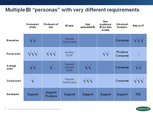
In this diagram I attempt to show
- Who's consuming vs. producing the information, how heavy or light that task is. What's interesting is that all our research shows is that most of the BI personas now are both consumers and producers of info.
- Who's using what style of BI as in reports, queries, dashboards and OLAP
- Who is using BI only as reports and dashboards embedded in enterprise apps (such as ERP, CRM, others), which usually means canned reports and prebuilt dashboards, vs BI as a standalone app
- Who's using non traditional BI apps, such as the ones allow you to explore (vs just report and analyze) and allow you to perform that analysis without limitations of an underlying data model
- Who's a producer and a consumer of advanced analytics
- And finally show the level of reliance on IT by every group
As always, all comments, suggestions and criticism are very welcome! HD