Drive Growth With Digital Accessibility: Best Practices From Three Retailers
This blog post was authored by Georgiana Swan.
With a turbulent and unprecedented current economy, most retailers are trying to shore up revenue wherever they can. One way to do this is through making your company’s websites and mobile apps more accessible. Annually, the disability community has a disposable income of $1.9 trillion, and an accessible digital storefront gives you access to this market.
While no retailer is perfect, look to the below companies for examples of accessibility best practices:
- Learn from REI and build accessibility into your design system. REI’s publicly available design system gives us a lens into how the brand is incorporating accessibility into its experiences. REI breaks down several core accessibility principles — such as providing helpful alt text and ensuring users can submit all forms — and how they fulfill these principles through their design system. Follow in REI’s footsteps and make your accessibility principles public; doing so showcases your commitment to the accessibility community which inspires customer trust.
- Follow North Face’s lead and use descriptive link names on your website. Vague link names such as “shop now” are not helpful for someone who is visually impaired and using a screen reader to access your site. Why? It’s common for screen reader users to pull up a list of links to navigate, so it’s important to ensure links make sense without the surrounding content. North Face does this well with their hyperlinks by explicitly stating what product type the link refers to (e.g., “shop jackets,” or “shop beanies”).
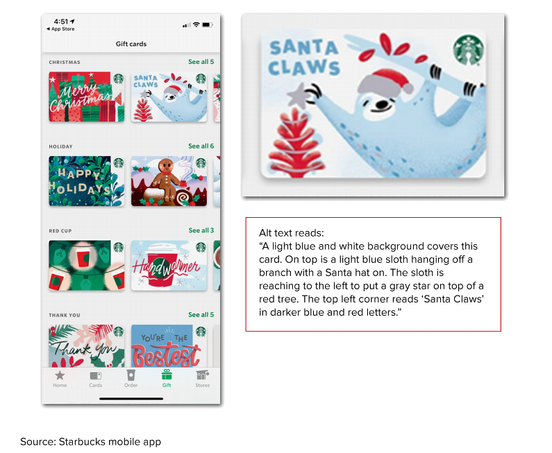
- Provide rich alt text like Starbucks does for its gift cards. A study from the Baymard Institute shows that 94% of the largest e-commerce sites have accessibility issues. This includes a lack of or insufficient alt text for images. Take a lead from Starbucks: The brand’s mobile app includes alt text for images of gift cards that describes what the card looks like — including the color of the text, the background, the fonts, and the pictures. Below is an example of a Christmas gift card.

If you’re a client and have questions about how to make your digital experiences more accessible, schedule an inquiry with me — I have lots of research and resources to help!
