How Poor UX Affected My Choice of Insurance Provider
This is a story of how user experience (UX) flaws drove me away from one insurance provider into the arms of its competitor.
Here’s what happened: I recently needed to purchase travel insurance for our family trip to Italy. Not having purchased travel insurance lately, I began my search online and clicked on one of the links that appeared in the search results.
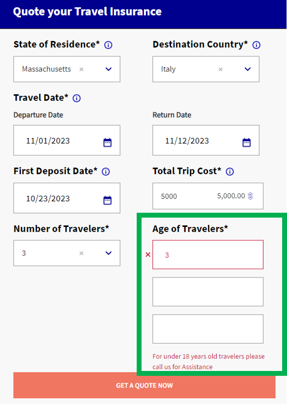
It all started as I expected. The website told me to fill out a form to get a quote, and I began entering the standard information: travel dates, destination country, and age of travelers. This is when the trouble began. I entered my three-year-old son’s age first, which produced an error message reading: “For under 18 years old travelers please call us for Assistance”

I tried to circumvent the error message by entering my and my husband’s dates of birth, but the site still refused to let me continue. Too tired to call for help, I traveled back to the search results and clicked the link for a different insurance provider.
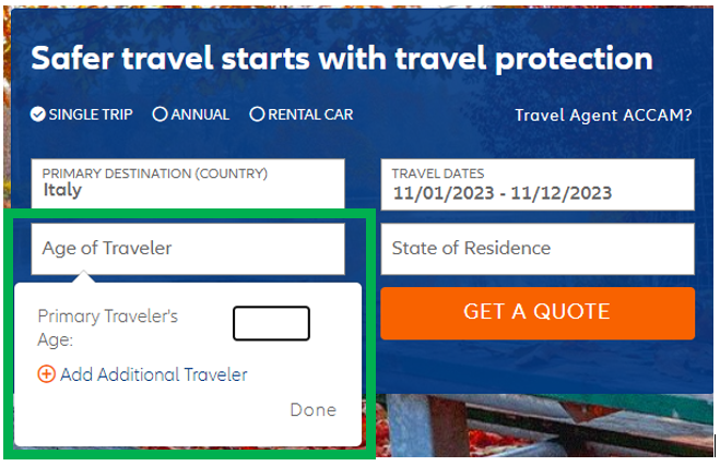
The second insurance provider also had a form to provide a quote. But this time, the form clearly stated that I needed to enter the “Primary Traveler’s Age” first. This, I realized, was also what the first provider’s form required — but unlike the second provider, the former offered no guidance on the form or in the error message; it just told me to call for assistance instead.

Still wanting to compare my options, I decided to move on with both providers. Unfortunately, UX issues continued to abound with the first company. Even after I completed the form, it was difficult to consume information. The tables it provided to compare plans required too much scrolling to view all the details, the text was too small, and the colors — light gray over a white background — were low-contrast, making reading and comparing plans difficult.
In contrast, using the second provider’s site was a breeze: It had strong contrast, larger font size, and didn’t make me scroll endlessly. Plus, it helpfully highlighted plans that were good for family vacations.
As I weighed my options, I asked myself: If I needed help with my policy, which company would be easier to interact with? Unsurprisingly, the answer was the second provider. The difference in cost wasn’t significant, yet my experience was far superior — both as an expert in evaluating user experience and as a regular, everyday customer grateful for an experience that eased my decision-making and made me feel understood. I purchased the plan and closed my laptop.
Improve Your User Experience By Conducting The Right Kinds Of Research
My experience shows firsthand how a company’s investment in UX directly impacts its revenue. When companies overlook easy-to-fix issues like vague labels, jargon, or poor error messaging, consumers will have a harder time doing core activities such as sign-ups and form submissions. Like me, they might grow frustrated and abandon the task altogether.
But there is a solution: Do user research. Companies that conduct user research gain a deeper understanding of customer needs and can catch UX issues early in the design process before they cause problems for customers. You can improve your user experience by conducting the right kinds of research and applying UX best practices. If the first insurance company had an error message clarifying what the problem was with entering my son’s age first, I would have fixed it and been less likely to go back to search results to look for other plans.
If you are a Forrester client and would like to discuss UX best practices and how user research can improve your customer experience, please reach out.
This blog was written with Research Associate Eleanor Theriault.
